This tutorial is going to walk you through how the various components of Google Data Studio work together to create your Data Studio report. We will walk through data sets, data sources, and have you try your hand at some report components such as charts, tables, and filters.
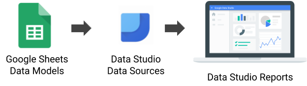
As a refresher to the process, the above image shows the steps we will take to reach a final Data Studio report. We will start by helping you gain access to a fake data set of student demographics. This will take the form of a Google Sheet. From there we will connect it to a Data Source mapping each field name to a field type such as Text or Number. Once we have our data source configured, we will create a report mapping those data fields to chart elements.
Before we dive into Google Data Studio itself, you need access to the data set used in this tutorial. We will be using a Google Sheet consisting of fake student demographic data. Clicking on the button below will cause Google to prompt you to make a copy of the Google Sheet.
Now that you have a data set, we want to connect it to Google Data Studio as a data source. For a data set, this only needs to be completed once. This is because a data source can be used in multiple reports. If you decide to create a second student demographics focused report later on, you can reuse this data source without needing to create a new one.
- Sign into Google Data Studio
- Click on
 along the left hand side
 - Click
 to create a new data source
 - Find the Google Sheets connector and click "Select"
- Find your data set and click
This will take you to a page where you can define the fields in the data set. On this page you can rename fields, change the field type, and set the default aggregation type. Take some time to rename fields and change field types if necessary and then click  . Data Studio will create a new report for you and confirm they are adding your new data source to this report.
If you have experience with the G Suite, you'll likely be familiar with most of the interface in Google Data Studio.
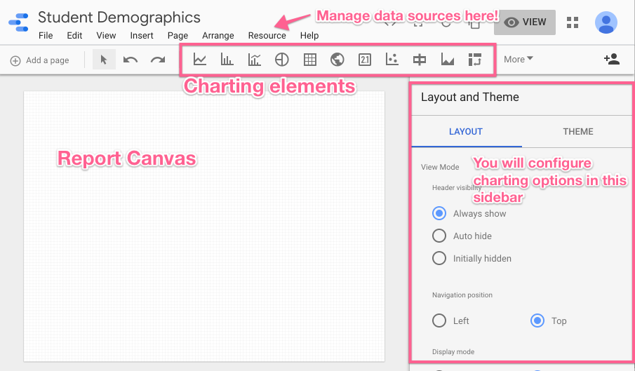
Resource Menu
If you ever need to return to the data sources screen to modify field names and data types, this is where you want to go. Resource → Manage added data sources.
Charting Elements
The report canvas can include text, images, and (of course) charts. This toolbar will give you quick access to all of your options. We will learn the bar chart in the next step of this tutorial. You should take time later to explore all charts available. Data Studio makes it easy to play with charts and delete them if they are not working. Full chart references can be found on Google's support site.

Sidebar
You'll see in the next step that when working with specific charts, the sidebar will transform to be your one stop shop for configuring that chart.
Let's dive in and create your first chart! When creating a chart, it's important to consider the type of information you want to show and how the underlying data is structured. It's helpful to start with a statistical question that you hope to be able to answer when looking at the chart. We will start simple with a simple one that is relatively easy to answer. How many students are enrolled in each grade level?
- Click the bar chart button.

- Now you have an object that you can add to the report using the cursor. Click and drag your cursor to add the chart to the desired size (don't worry, it's like Google Drive, you'll be able to tweak the size and formatting later!).
- Once the chart is created, you'll notice that Google Data Studio pre-fills the chart with data from your data source and a sidebar opens on the right of the screen. The header of which should look like this:
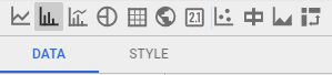
To configure the report, you'll need to stay in the "Data" tab.
- Dimensions describe. Metrics measure. In our question "How many students are enrolled in each grade level?" the dimension, or field we are using to describe the data, is grade level. In the "Available Fields Column," select the dimension "Grade Level" and drag it to replace the green dimension field. OR Click the default green dimension field and select "Grade Level" from the list.
- By default, "Grade Level" appears as a metric since all of the values are numbers. You can paste a metric into a dimension field and Google Data Studio will treat the numbers as categorical information. Alternatively, you could change the data type in the Data Source controls (which is a recommended practice as you continue to advance in your competency in Data Studio).
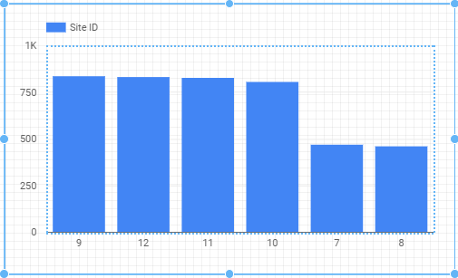
- Your x-axis should now have the different grade levels in the data set across the bottom, with a column for each.
- Now we need to configure the measure. There are a lot of ways to get a count, but a tried and true way is to use the Student ID number. Since each student has precisely 1 student ID number, we're going to do a "Count Distinct" aggregation of that metric.
- Add the Student ID metric to the Metric field. Then click the aggregation button to the left (SUM is default). When you hover over it, the "edit" pencil will appear.
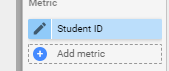
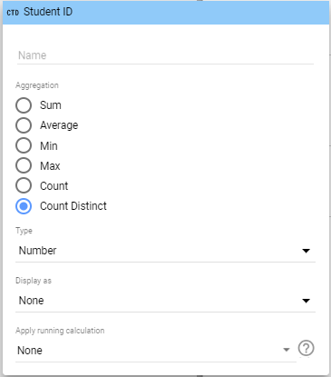
- In the Metric configuration window that appears, select Count Distinct from the aggregation options.
- Now you'll notice the new metric will appear in the legend of the chart, and the size of the bars will change to correspond with the count of students.
- By default, Google Data Studio will sort the chart descending by metric. Depending on the purpose for the visualization, that might not be ideal. For this application, we'll sort ascending by grade level. Select Grade Level under the sort card and select ascending from the drop down. The result should be this.
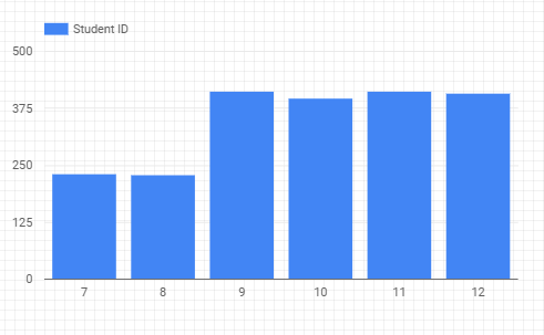
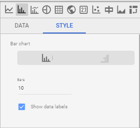
- Finally, there are a lot of customizations that you can make (hey, it's Google). If you select the Style tab, you'll see lots of options. The only one we're going to use is the "show data labels" check box. Viola! You'll see the values printed on the bars in your chart. You now have a very clear and easy to read chart that shows how many students are in each grade level.
Creating charts proves to be pretty easy once you understand the underlying data structure and how to manipulate the controls. Like anything, though, it requires practice. You've dipped your toe in the water and we've built the first chart together. Take some time to experiment by creating additional charts that will use this data set.
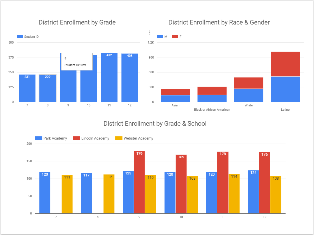
One path is to build off of the "enrollments by grade" chart that we created. You can manipulate the chart a bit by changing the dimensions dividing the data. Your task is to develop charts that answer the questions:
- How do the enrollments by grade compare between schools in the district?
- How do enrollments vary by race and gender?
Here's a basic example of a dashboard that answers our three questions of our data set. There are a virtually unlimited number of ways to polish and customize these to suit your needs. Effective data leaders engage in a feedback cycle to prevent the DRIP syndrome (data rich, information poor) so explore how professionals are using the data regularly and revise often!
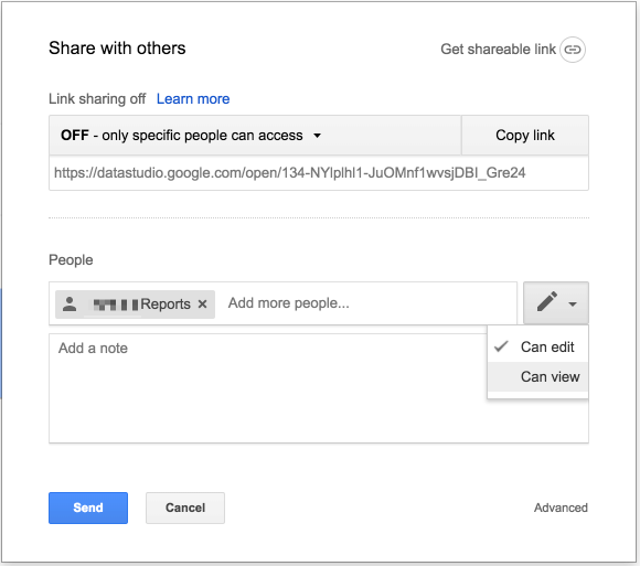
Sharing is the same as any Google Drive file! Whether you are in edit mode or view mode, you will see this icon  at the top of the page. You will be presented with the same share box available across many Google Products. You can decide to share individually, with a group, or create a shareable link.
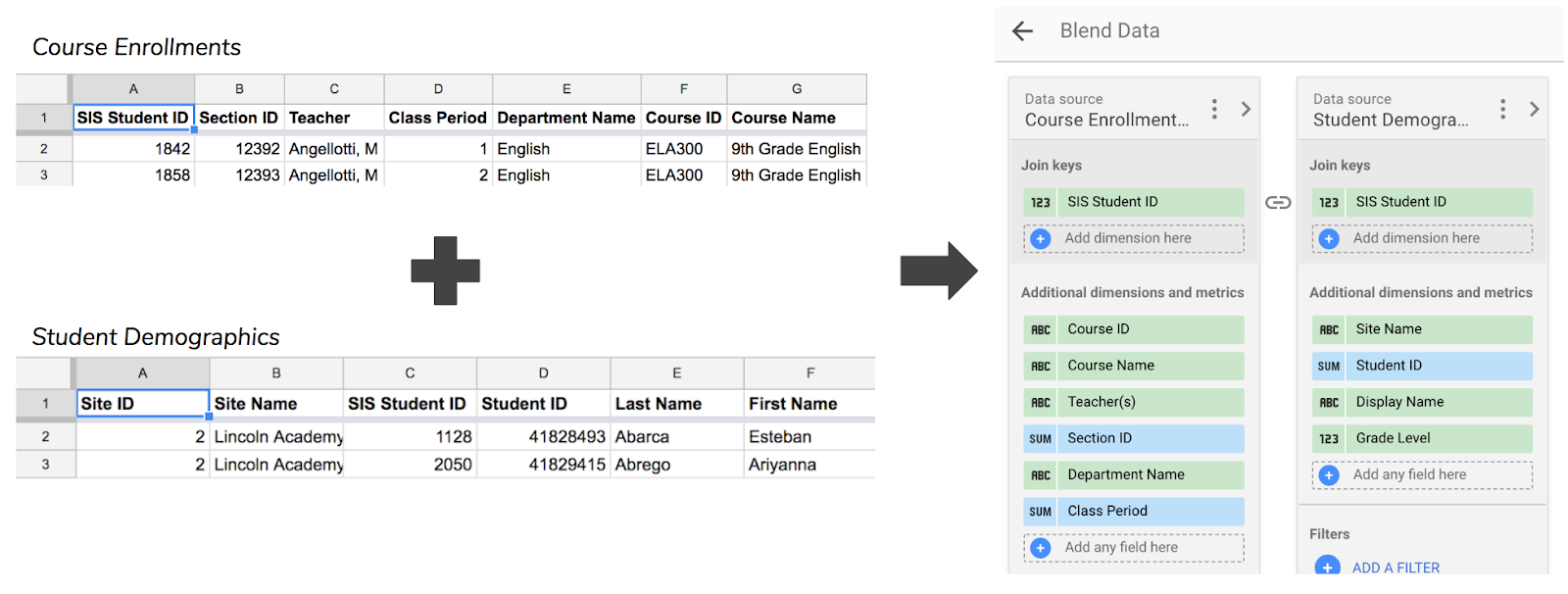
As you get more comfortable with data sources in Google Data Studio, you may find that you need to combine data sources to create a unified data source. This is where data blending comes in! To help us understand data blending, let's give an example. You currently have a data set that gives you student demographic data. Let's say we want to create a report that looks at course enrollment data and also include student demographic data in that report. Take a moment to copy the Google Sheet below and look over our fake course enrollment data.
One option would be to add columns to the course enrollment Google Sheet to include student demographic data. We could copy it in from our Student Demographics Google Sheet, but this creates a problem. We would then have information such as grade level stored in multiple Google Sheets. If we needed to update a student's grade level, we would need to update multiple sheets and that can get confusing fast.
Instead you are going to create a new data source (following the process outlined in step 3 of this tutorial) for course enrollment data and create a new report. Once you have that new report, head to Resource → Manage blended data and click 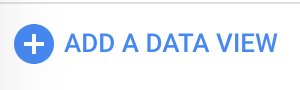 . Create a data view that looks similar to the right side of the graphic below. You did it! Click "Save" and "Close" and try adding a table using this new blended data source.
You're at the end! Hopefully you feel comfortable and understand how to bring data into Google Data Studio, create visualizations, and share those dashboards with users in your organization. In this Codelab we used Google Sheets as our data connector, but Data Studio supports at least a dozen more including Google Cloud SQL, BigQuery, Cloud Storage, MySQL, and PostgreSQL.
We recommend you keep an eye on the updates blog for Data Studio as well as this is a beta project that is being developed at a rapid pace.
Best of luck!